Threads
A clearer space to write, add to a thread, and publish.
When Threads launched in 2023, I kept noticing small points of friction in its post composer. I focused this independent redesign on one screen: making space to write while keeping its controls easy to find.
This concept reflects my personal experience of the app around launch. The images below walk through the changes I proposed at the time.
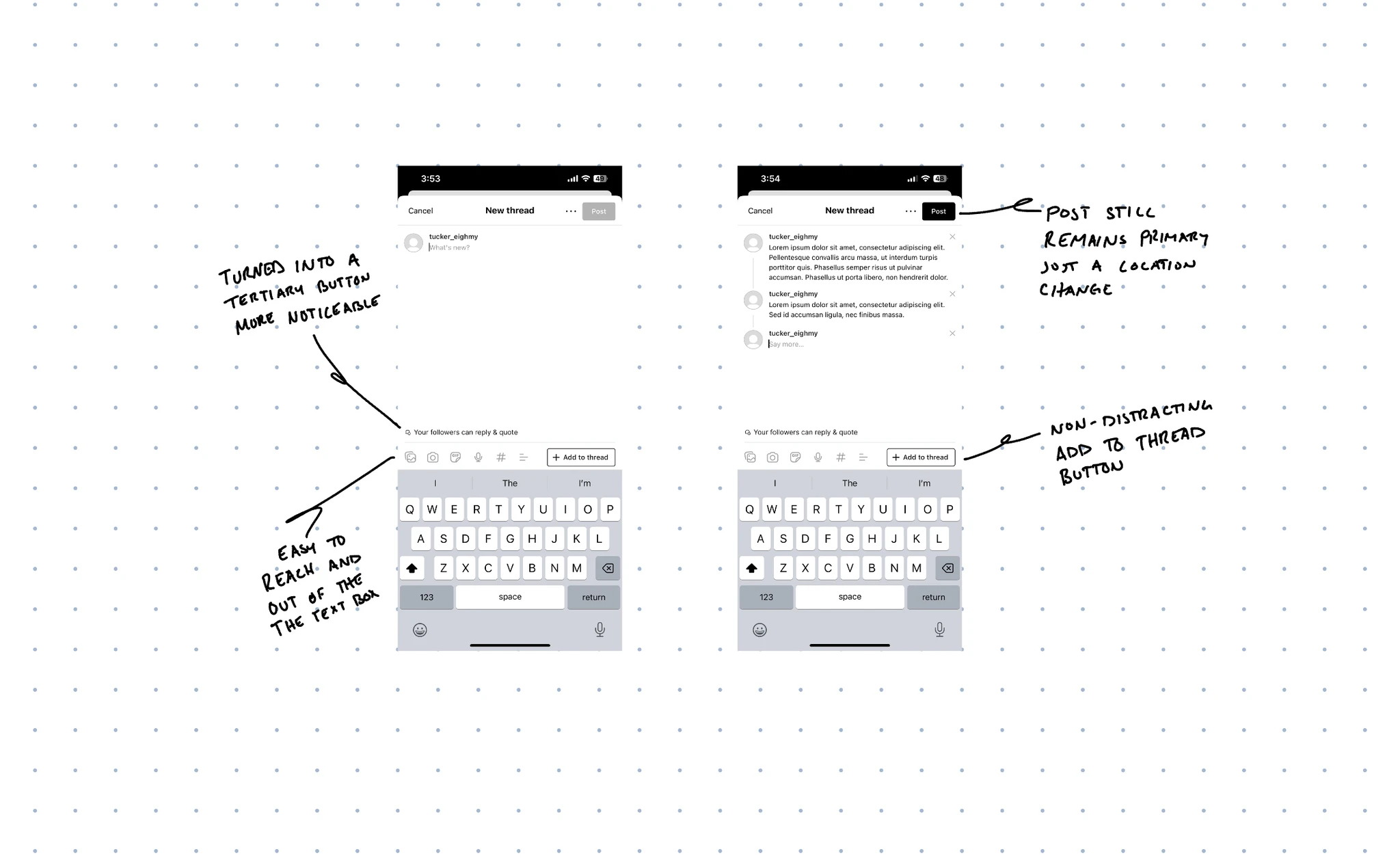
Make reply settings look like a control
I initially missed that the reply setting was tappable. It looked like a caption, even though it controlled who could respond. Darker text and a small icon were intended to make that choice easier to notice.
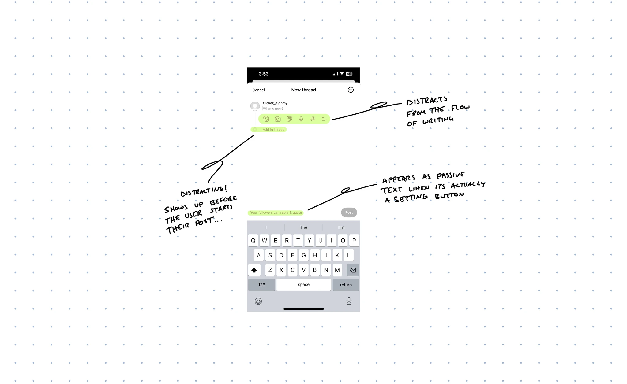
Move the actions without making them jump
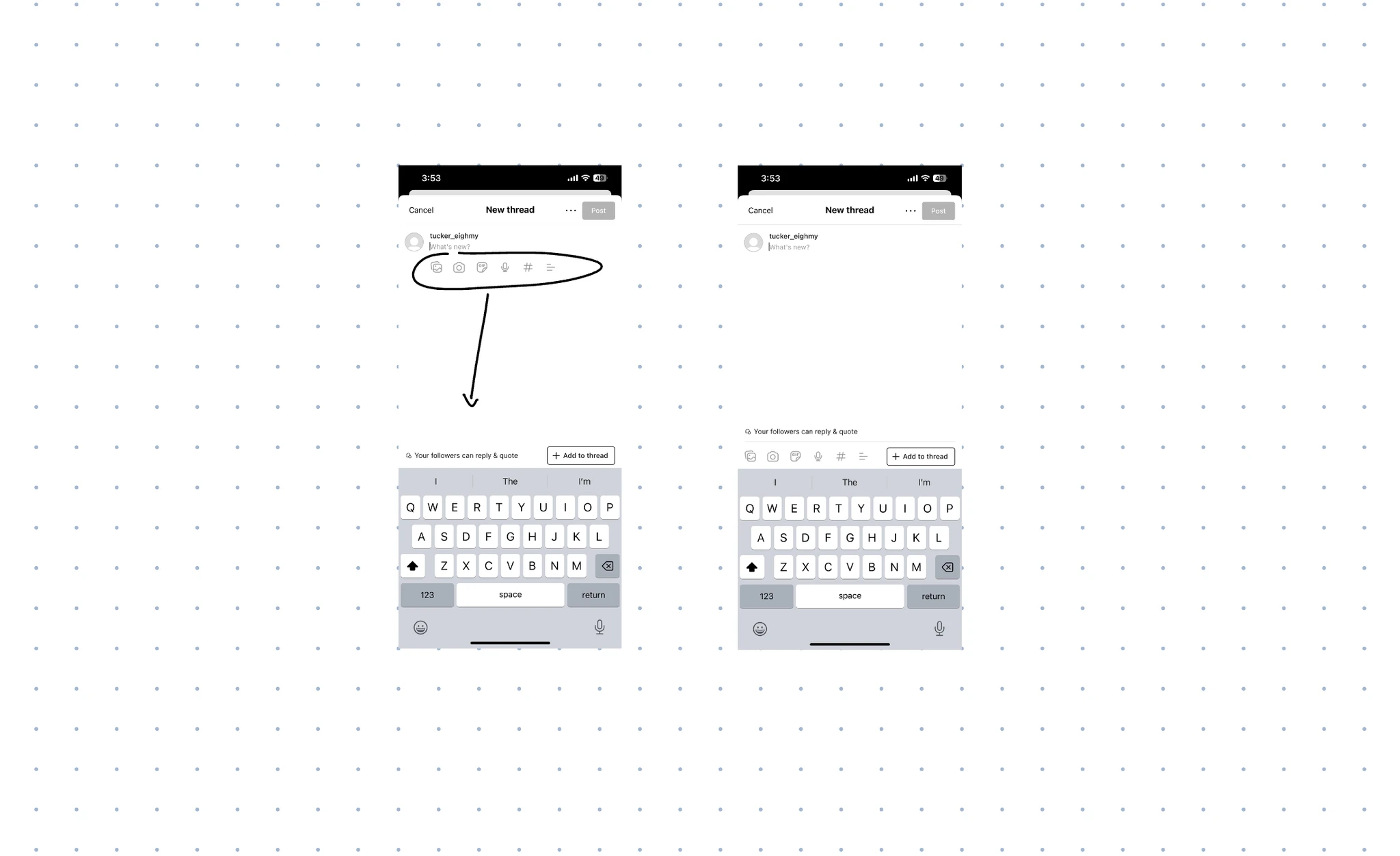
“Add to Thread” competed with the first post before I had written anything. I considered hiding it until typing began, but that would make a control appear mid-thought. Instead, I gave it a stable place above the keyboard.
I moved Post to the top right to distinguish publishing from the tools used while composing. The intention was to make that final action feel deliberate.
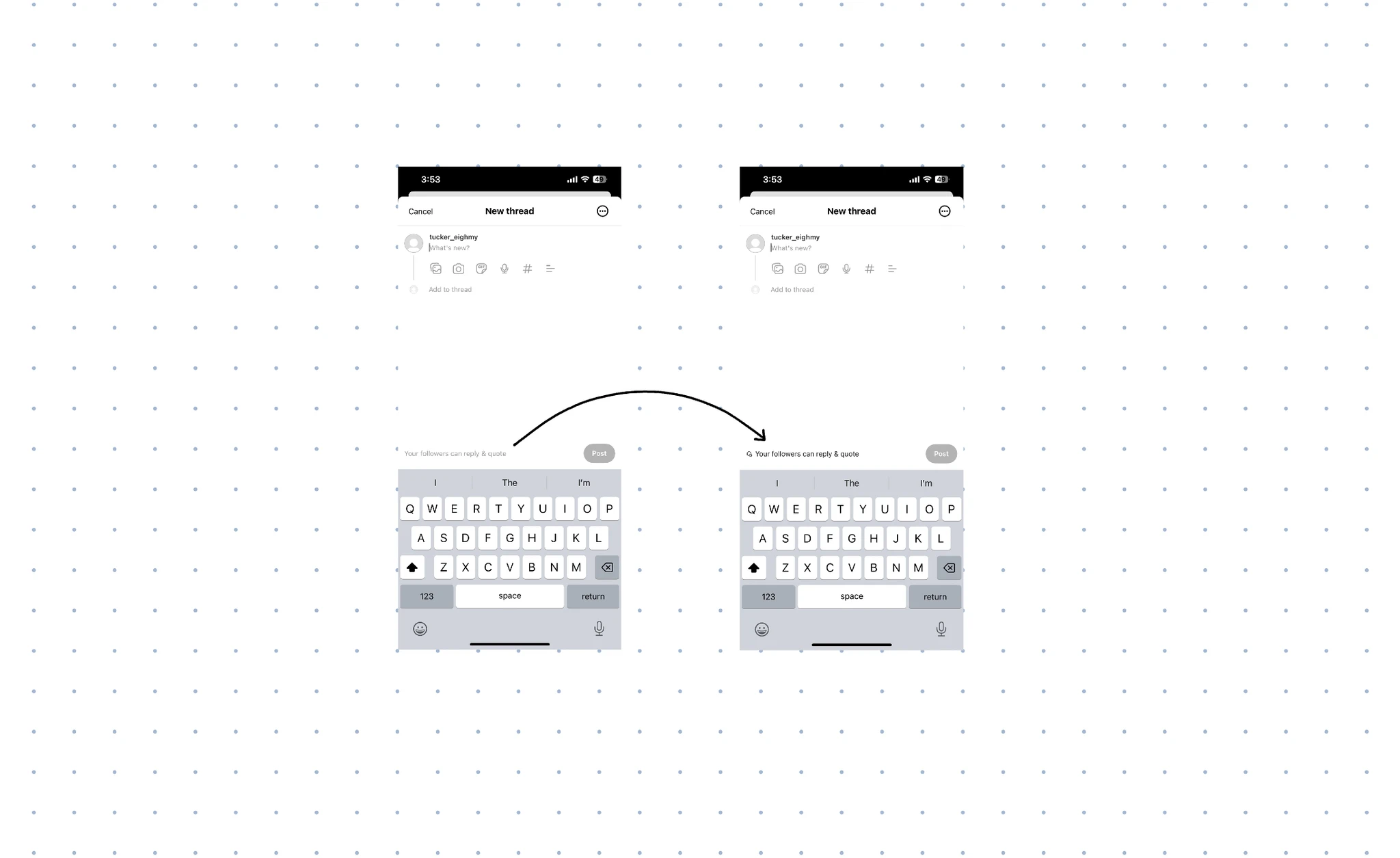
Keep the writing area clear
The media icons crowded the space beneath the text. Moving them above the keyboard, alongside “Add to Thread,” grouped the editing tools in one place and left more visual space around the draft.
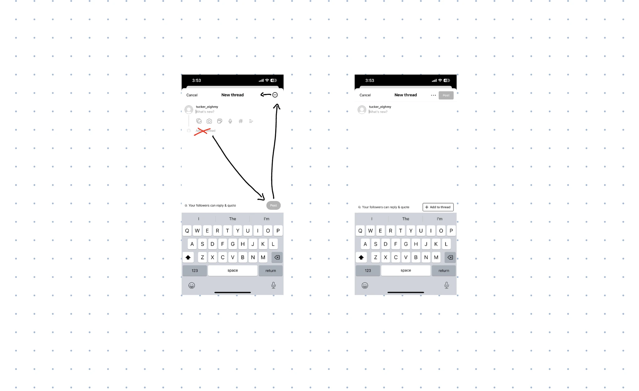
What this exercise showed me
A small rearrangement can change the hierarchy of a familiar screen. The harder choice was deciding what should stay visible while someone writes. This remains a design concept; testing would be needed to learn whether those choices make composing and publishing easier.