LiveLink | Discovery
Music discovery platform connecting fans with live events and emerging artists.
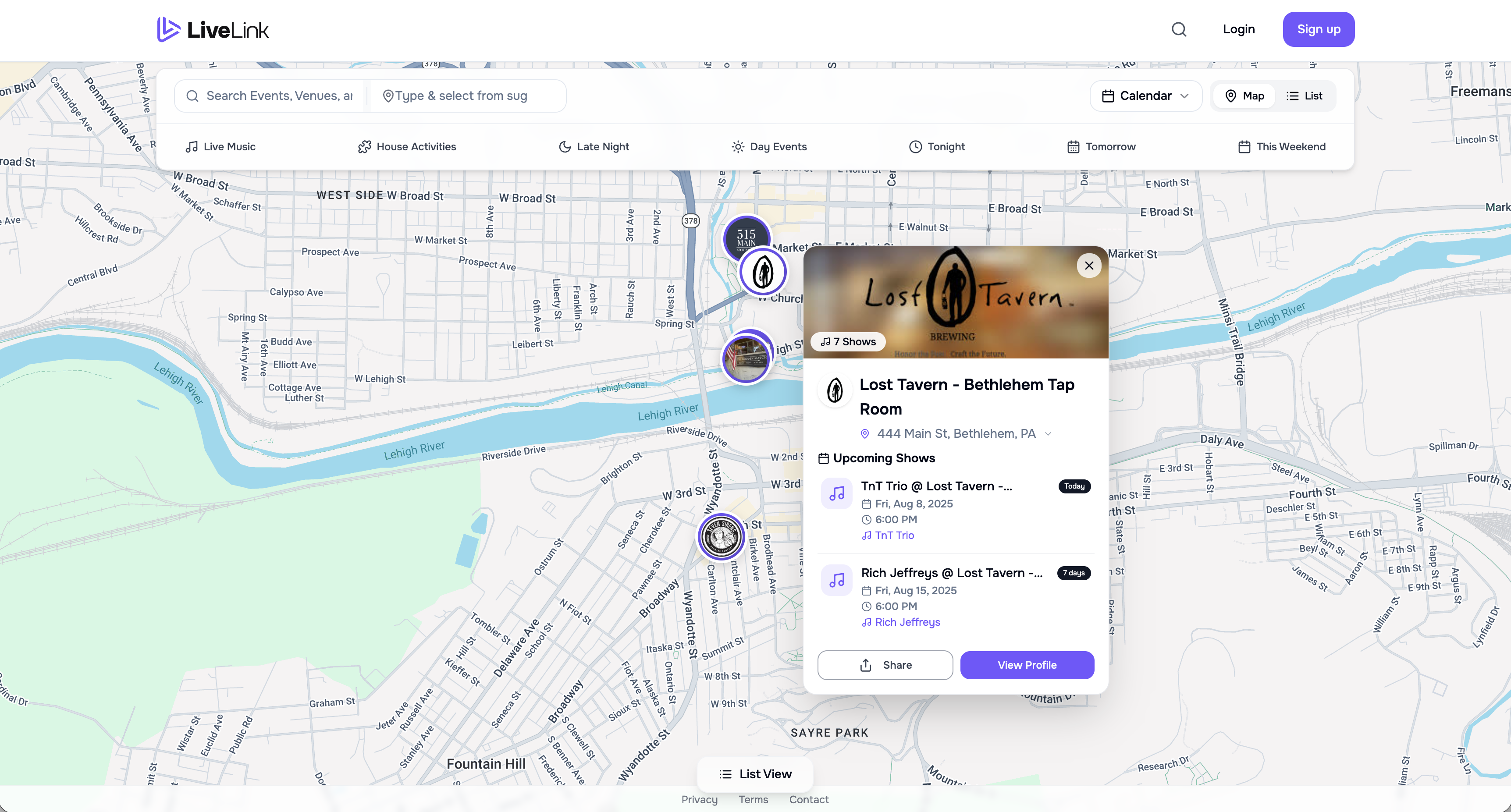
LiveLink started with a very basic problem: finding local events is weirdly hard.
Most of the time you don’t “discover” something, you trip over it. You see a story from a venue you happen to follow. You see a flyer in the bathroom. You walk past a poster in a window. If you don’t already know where to look, you miss a lot of good stuff.
That gets worse the moment you’re trying to find something outside your usual spots. New venue, new neighborhood, different type of night. Now you’re back to luck.
LiveLink Discovery was my attempt to make this feel more like browsing and less like detective work.
I designed and built the full experience myself, based on 100+ interviews with venue owners, performers, and people who actually go out. The goal wasn’t to ship a “cool map.” It was to solve the boring part: figuring out what’s happening and whether it’s worth leaving the house.
What people were doing before
The answers were consistent and kind of depressing:
Instagram
posters at the venue
group chats
“I heard about it somehow”
nothing at all
No one had a clean way to answer “what’s going on near me tonight?”
Starting point: the map
I made the map the default because venues are physical. People plan nights around where they are and how far they want to travel. A spatial view gives you that context instantly.
Some people hate maps. They want a straightforward list.
So the experience supports both. Same data. Two ways in.
Map for browsing.
List for scanning.
I didn’t overthink this. It’s just how people behave.
Filters that match how people talk
People don’t think in categories the way event platforms do. They don’t say “show me all nightlife experiences.” They say “live music” or “trivia” or “something tonight.”
So I kept the filters simple:
Live Music
House Activities (trivia, bingo, game nights)
Tonight / Tomorrow / This Weekend
The main goal here was speed. Fewer clicks between “open the site” and “oh, there’s something I’d do.”
Clicking into a venue
When you click a venue on the map, you get a quick panel with what’s coming up. It’s meant to be lightweight. Enough to decide whether to dig deeper.
From there you can open the venue page.
[Place image: Venue Page Overview]
The venue page is basically where you land if you’re the kind of person who already has a favorite spot and wants to see what they have coming up.
It includes:
a short description and links
social embeds
upcoming events
a calendar view
The calendar view
I added calendar view because some venues have a rhythm. Weekly trivia. Monthly specials. Music every Saturday. Seeing that pattern changes how people understand the place.
It also makes the venue feel active. A list of events doesn’t always communicate that.
The thing people cared about most: hearing the performer
This was the biggest takeaway from research and it stayed true once people started using the product: local performers aren’t big names. People don’t know who they are. They’re not going to do homework.
So I treated “preview the artist” as core, not a nice-to-have.
Event pages support embeds from:
SoundCloud
Spotify
YouTube
Facebook
Instagram
Bandcamp
This wasn’t about being fancy. It was about giving venues an easy way to add something that lets a user press play.
Once you do that, decisions get easier. People stop bouncing out to search the artist, then forgetting what they were even looking at.
This was the feature people got excited about in interviews. The reaction was always some version of: “Finally, I don’t have to research.”
Sharing
Sharing is basic, but it matters. If someone finds something good, they should be able to send it in one click.
Copy link, text, email, Instagram, Facebook. Keep it moving.
What I learned the hard way
The product problem was obvious. The marketplace problem wasn’t.
Venues need it to be easy to add information.
Performers need it to make them look good.
Audiences need it to be fast and trustworthy.
If any one of those breaks, the whole thing gets shaky.
Also: I didn’t build the analytics I wish I had. I was moving fast and building solo. I had qualitative feedback, I had usage, I had people telling me what they liked. I didn’t have the kind of instrumentation that would have made iteration cleaner.
If I were doing another pass, I’d start tracking:
preview plays
map vs list usage
which filters get used
which events get shared
drop-off points on event pages
Not because dashboards are fun. Because it makes decisions less emotional.
Why this work mattered later
Discovery wasn’t a throwaway feature. It became the base layer for everything else, including the festival build.
It established the two bets that kept holding up:
people need to see events in context (where and when)
people want to hear local artists without leaving the page
That’s what I kept building toward.