Threads Redesign
Conceptual redesign of the Threads social platform with improved UX.
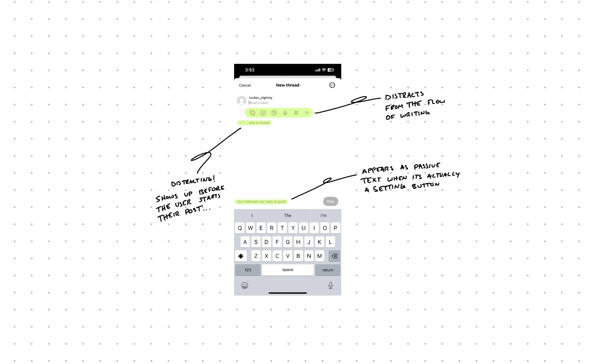
When I signed up for Threads, I didn’t expect to end up with an account I couldn’t delete without also deleting my Instagram. Since I was stuck with it, I decided to actually use it for a bit and see how it felt. The more I explored, the more the whole experience felt unfinished, like it had been rushed out before anyone really sat with the details. The post creation screen stood out the most: cluttered, confusing, and clearly in need of some care.
Instead of trying to redesign the entire app, I narrowed my focus to this one screen and looked for simple changes that could make it feel calmer and more intentional for the people using it.
 Reply settings that actually feel interactive
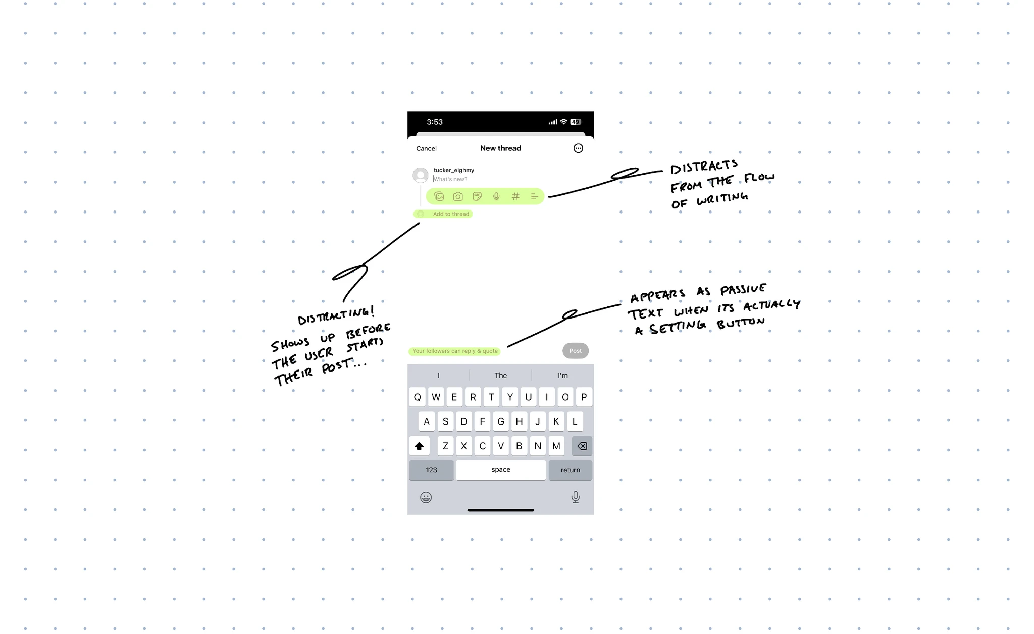
The first thing that caught my eye was the “Your followers can reply & quote” line. Or, more accurately, it did not catch my eye at all. It just looked like plain text under the content field, so I completely missed that it was something I could tap. That would be fine if it were a label, but it controls who can interact with your post, which is a pretty important decision to hide in what looks like static copy.
To fix that, I treated it like the control it really is. I darkened the text and added a small icon, so it reads more like a button and less like a caption. It is still subtle and out of the way if you are not interested in changing it, but now it clearly looks like something you can interact with when you are.
 Cleaning up the core actions
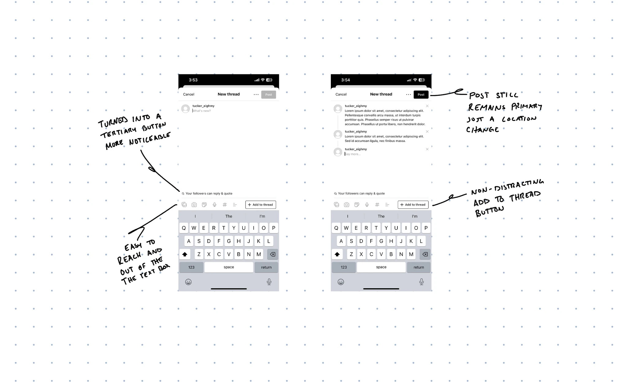
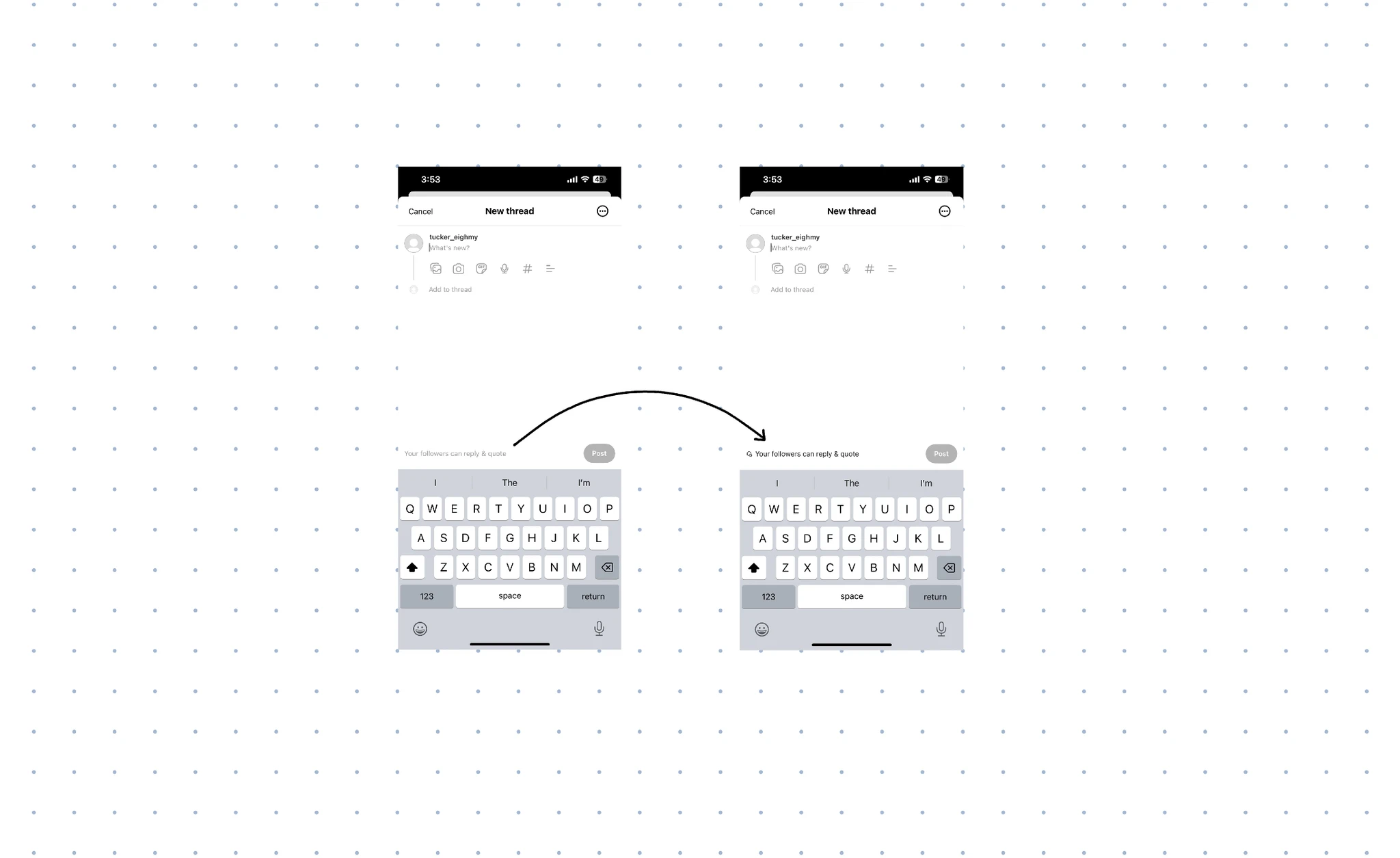
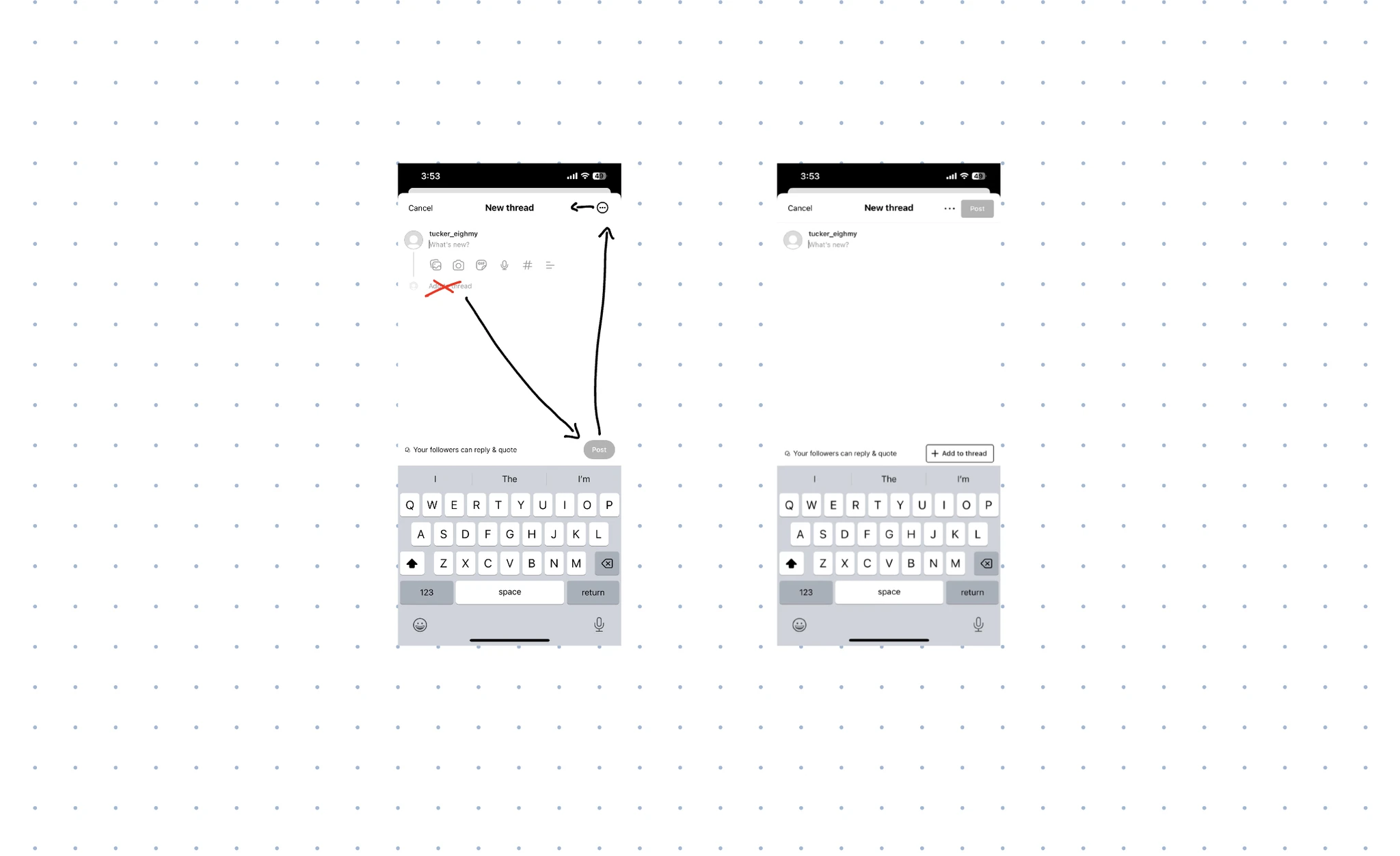
Next, I looked at the “Add to Thread” button. For some reason, it showed up under the content field even when I had not typed anything yet. It felt like being asked to add a sequel before you have even written the original. It pulled focus too early and made the layout feel busy.
My first thought was to hide the button until you start typing, but having controls pop in mid-thought can feel jumpy and distracting. Instead, I moved it. I placed “Add to Thread” above the keyboard, in the space where the Post button originally sat. That area already behaves like a home for secondary actions, so it feels more natural to keep threading there, within reach but not demanding attention.
The Post button itself also needed a new home. Originally, it sat just above the right side of the keyboard, similar to a “send” button in a chat app. That placement encourages quick, almost impulsive sending, which makes sense for texting your friends but less so for posting to a wider audience. Moving the Post button to the top right of the screen gives it a more deliberate feel, closer to how email apps treat sending. It creates a small mental pause that invites you to review what you are about to share.
 Giving the media bar a proper home
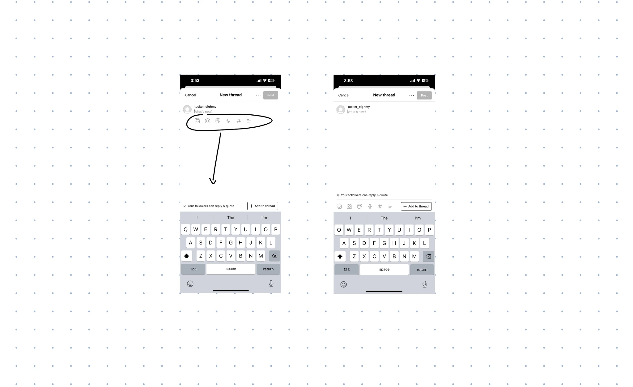
The last piece of the puzzle was the media bar. The icons for images, GIFs, hashtags, and other extras were sitting directly under the content field, crowding the area where your attention should be on writing. They felt like visual noise that kept competing with the text box.
So I moved the media bar to sit neatly above the keyboard, alongside “Add to Thread.” Grouping them there turns that area into a clear “tool zone,” and the writing area into a “focus zone.” You still have quick access to media when you want it, but it no longer dominates the space where you are trying to think and type.
 A small set of changes with a big feel
With just a few adjustments, the post creation screen feels much more organized and intentional. The reply settings now look interactive instead of invisible. The “Add to Thread” button lives in a calmer, more appropriate spot above the keyboard. The Post button has moved to the top right, which gives posting a more thoughtful, less impulsive feel. The media bar is tucked into a dedicated tool area instead of crowding the main canvas.
None of this exists in the actual Threads app yet, but in this redesign, the screen finally feels like it is working with the user instead of against them. The distractions are reduced, the controls are where you expect them, and the main focus goes back to what actually matters: writing something worth sharing. This is not a complete reinvention of the product, just a more intentional version of a single page. Threads still has plenty of room to grow, but at least this part no longer feels rushed.