Threads: Redesigning the Post Creation Screen
By Tucker Eighmy
When I signed up for Threads, I didn’t expect to be trapped in an account I couldn’t delete without also deleting my Instagram. But, since I was stuck with it, I figured I might as well explore the app. What I found was a user experience that felt half-finished, like someone rushed it out the door. The post creation screen, in particular, stood out—cluttered, confusing, and in desperate need of attention.
Rather than trying to fix the entire app (I'll leave that for the team at meta), I decided to focus on this one page. Here’s how I reworked the glaring issues to make it a little more user-friendly.
01
The Reply Settings
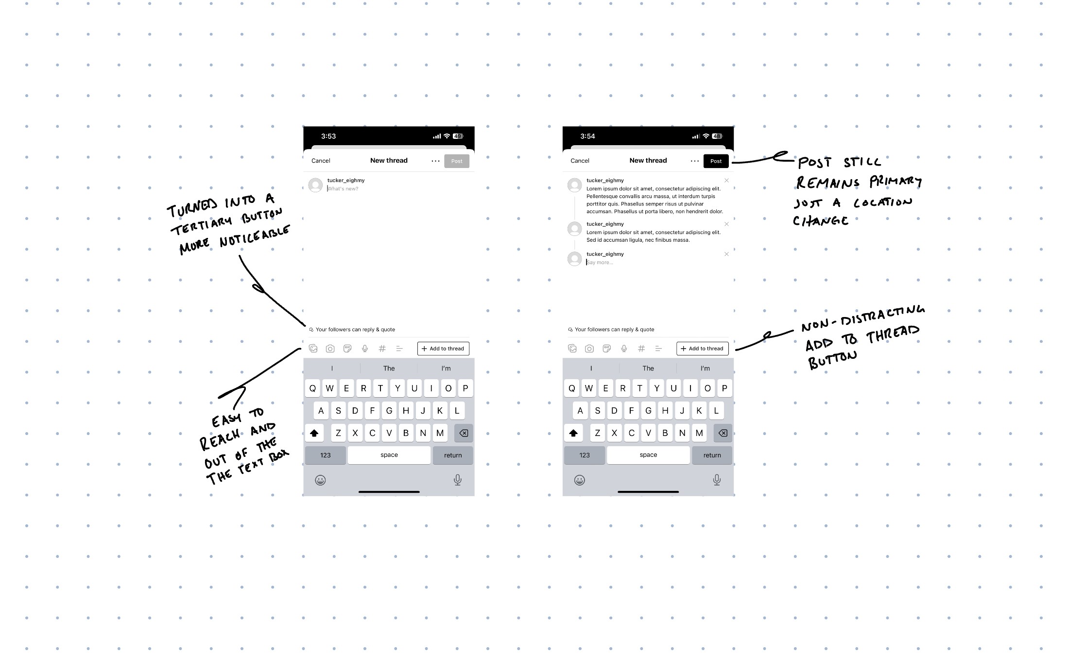
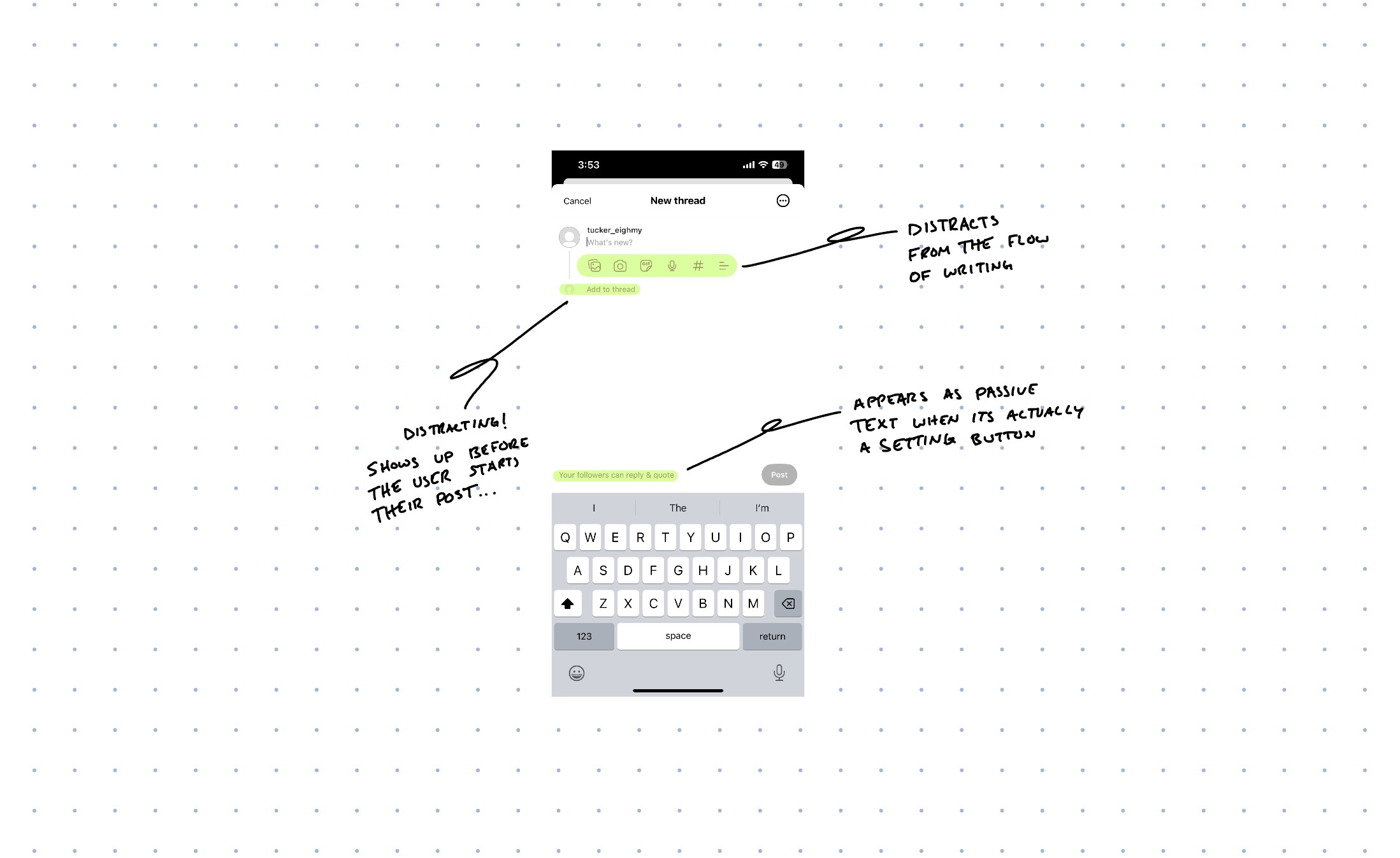
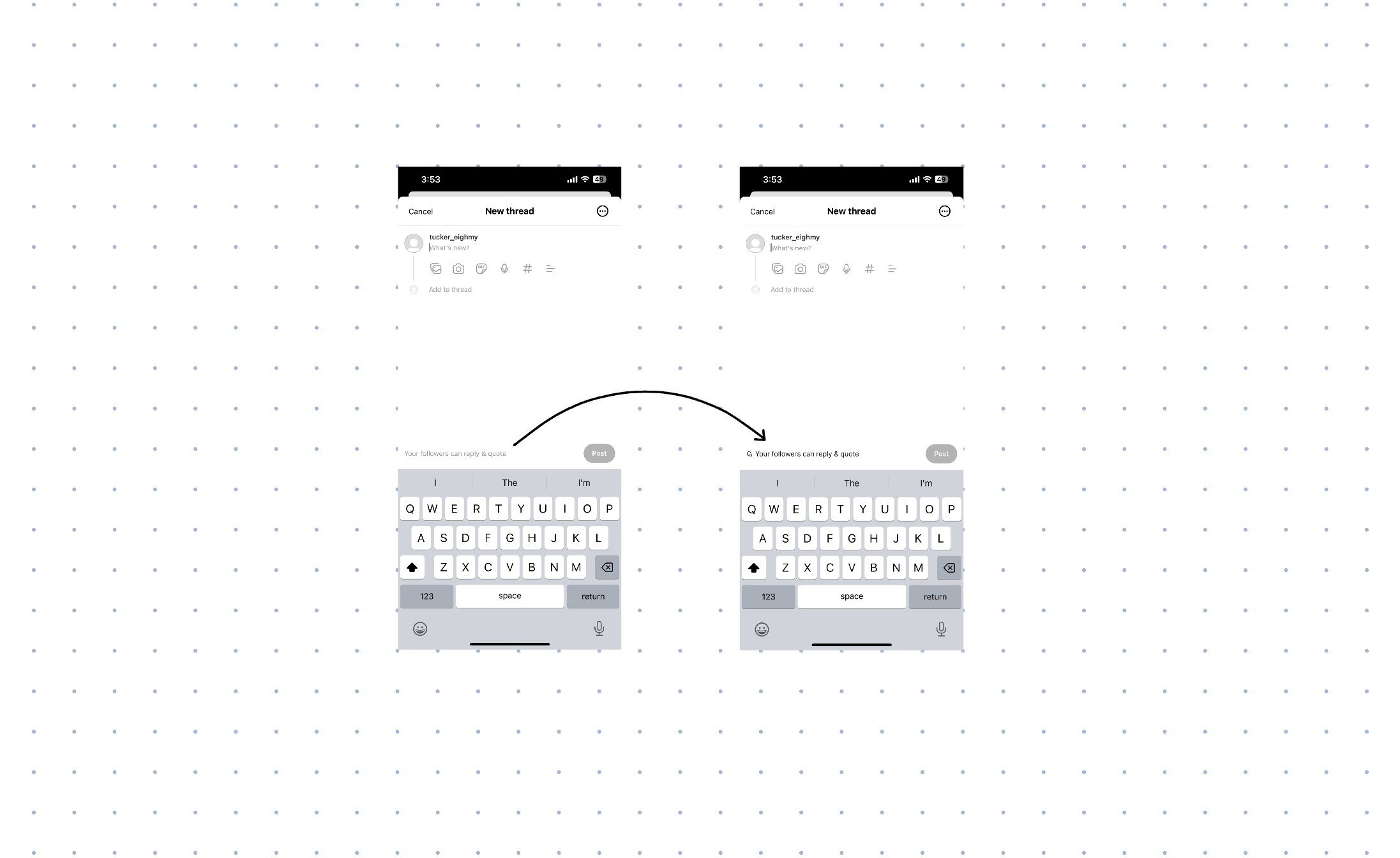
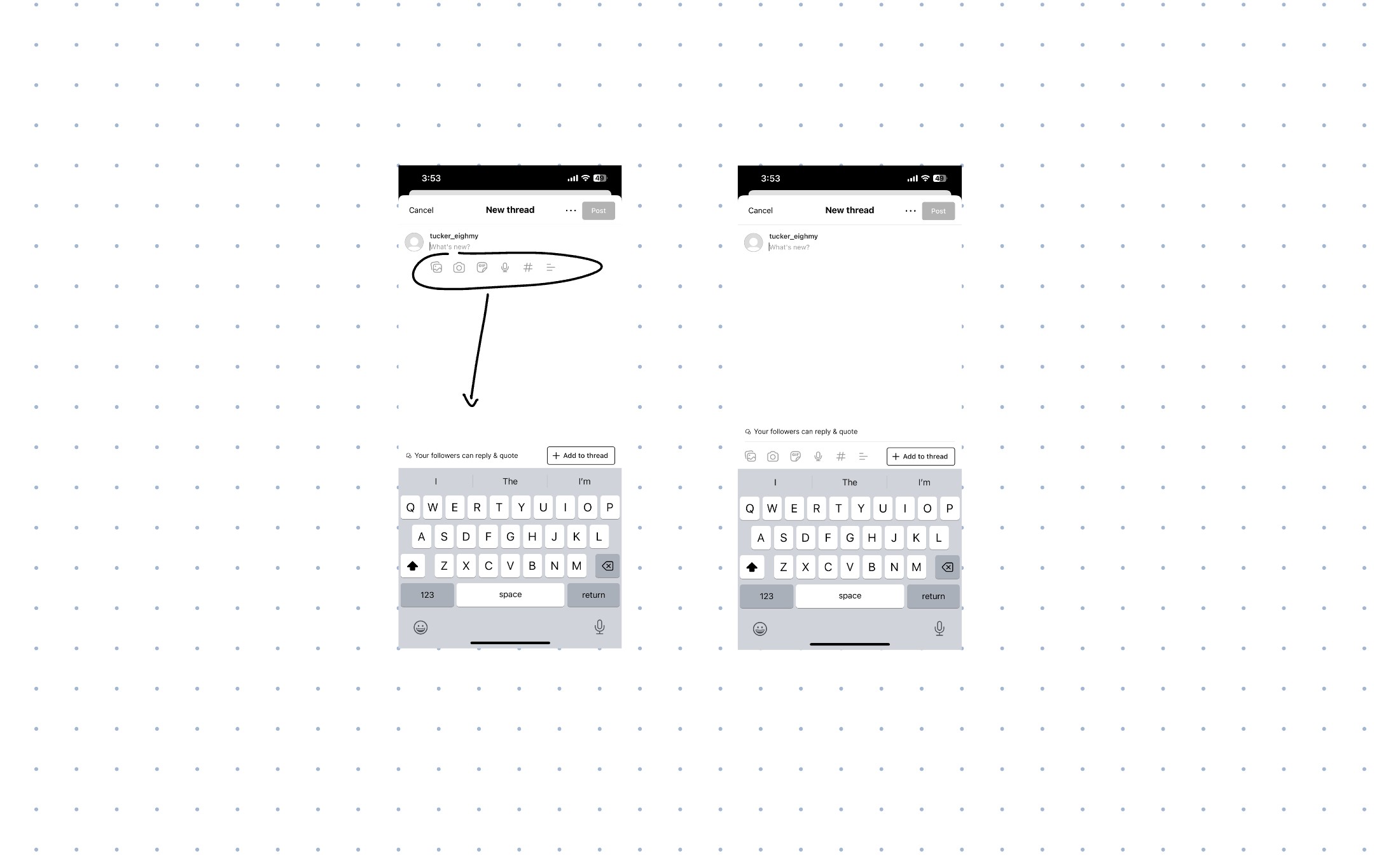
The first thing that jumped out at me was the "Your followers can reply & quote" setting—or more accurately, it didn’t jump out at all. It looked like plain, static text sitting under the content field, so I didn’t even realize it was interactive. But this setting controls who can interact with your post, which seems pretty important, right?
To make it more user-friendly, I darkened the text and added a small icon next to it, turning it into a clear, clickable button. Now, it feels more like something you’re meant to interact with. It’s a subtle change, but it ensures users won’t miss out on this crucial feature, while still keeping it out of the way for those who don’t need it.
02
Cleaning Up the Buttons
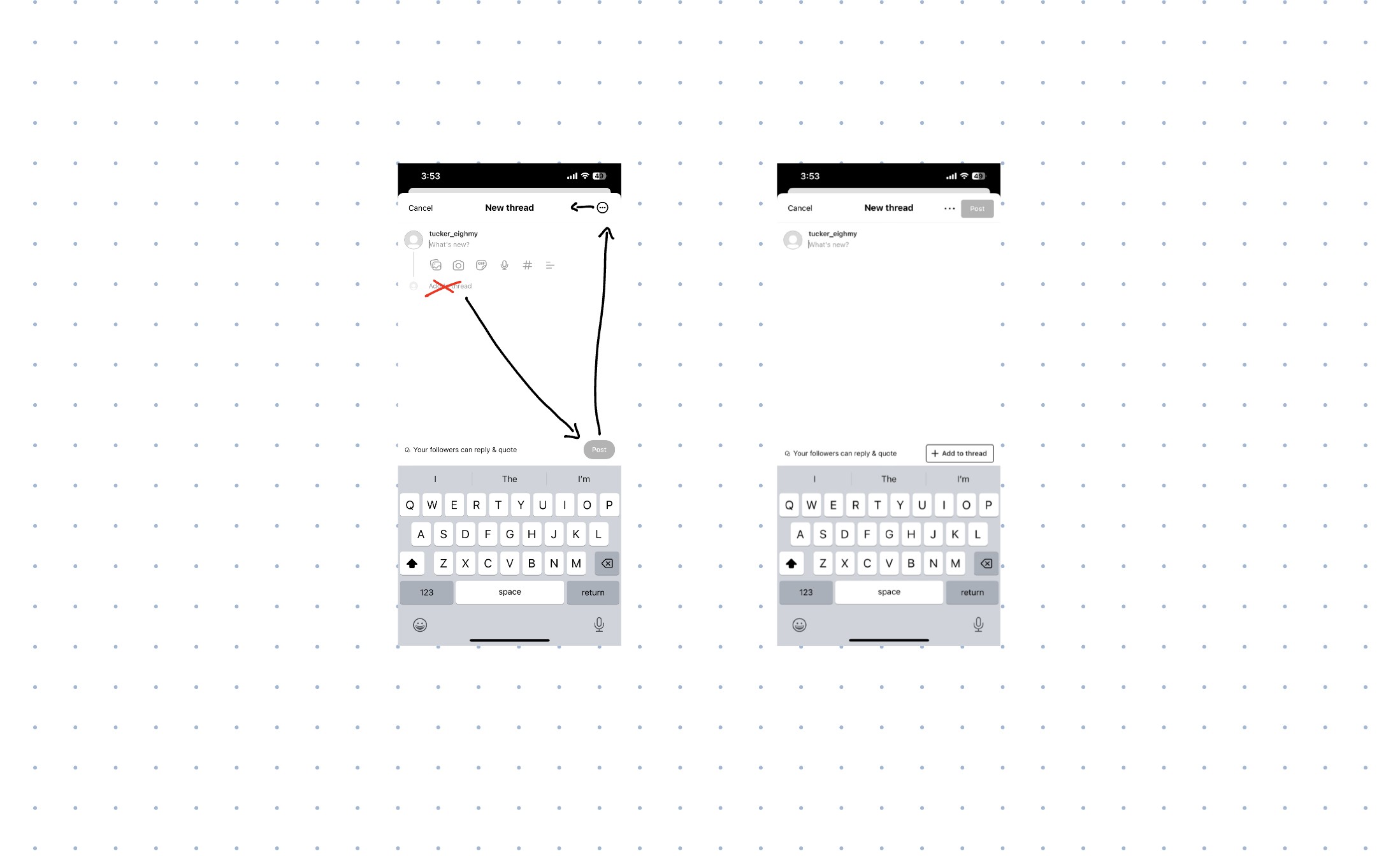
Next, I turned to the "Add to Thread" button. For some reason, it was sitting under the content field before I’d even written anything. Why would I add to a thread when I haven’t started a new thought? It was distracting and out of place.
Initially, I thought about hiding it until users started writing, but that felt like it would be equally disruptive—having a new button suddenly appear mid-writing isn’t exactly calming. So instead, I moved it. I relocated "Add to Thread" to the right above the keyboard, where the Post button used to be. This spot felt like a more natural home for secondary actions like threading posts, where it’s available but not intrusive.
That left the Post button, which originally lived just above the right side of the keyboard—kind of like the "send" button in your messaging app. But posting on Threads feels like it should be more deliberate than firing off a quick text to your fantasy football chat. So, I moved it to the top-right corner of the screen, similar to where the send button is in most email apps. This shift gives users a bit more mental space, making the act of posting feel more thoughtful, like something you’d review before sharing to the world.
02
Organizing the Media Bar
Lastly, I had to do something about the media bar. The icons for adding images, GIFs, hashtags, and more were sitting awkwardly below the content field, cluttering the space where the user should be focused on writing. It felt like the media tools were floating without purpose, constantly inviting distraction.
To resolve this, I gave the media bar a proper home above the keyboard, where it can sit alongside other tools like the "Add to Thread" button. This positioning feels more natural, keeping the focus on writing first and adding media second. By separating the media options from the content field, the interface became cleaner, and the writing space feels less chaotic.
02
A Clean, Thoughtful Redesign
With just four changes, the post creation screen is much more organized. The reply settings are now clear and clickable, the "Add to Thread" button has been moved to a more appropriate spot above the keyboard, and the Post button now lives in the top-right corner, giving the posting process a more thoughtful feel. The media bar is tucked neatly above the keyboard, ready when you need it, but not cluttering up the space when you don’t.
These changes haven’t been implemented on Threads (yet), but in this redesign, the post creation screen finally feels like it’s working for the user, not against them. The distractions are minimized, and the tools are where they need to be, allowing users to focus on what really matters—writing.
It’s not about reinventing the wheel, but about creating a space that encourages users to think and engage with the platform without being overwhelmed by poor design choices. Threads may still have a long way to go, but this page at least feels a little less rushed. And that’s a start.